Arts Digital Art
Intermediate
45 mins
Teacher/Student led
80 points
What you need:
Chromebook/Laptop/PC or iPad/Tablet

Using Color in Digital Art

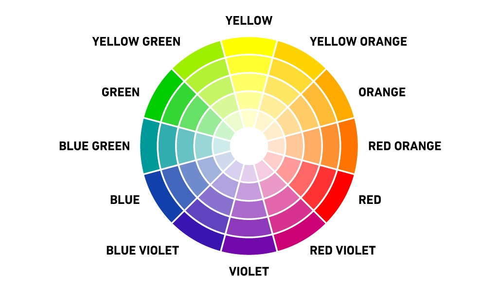
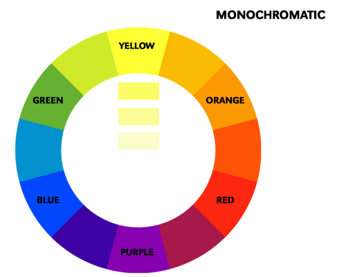
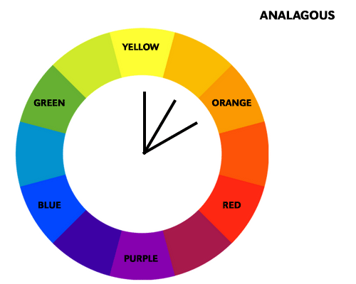
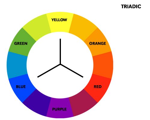
Discover the power of colour in digital art. Learn about different colour schemes, including monochromatic, analogous, complementary, and triadic. Understand how colour can influence mood and emotion in your artwork. Explore techniques for applying colour effectively, and gain tips for choosing the right colour palette. This step-by-step guide will enhance your digital art skills.
Learning Goals Learning Outcomes Teacher Notes

Live Class Feed

This is a live feed of the latest activity by your students on this lesson. It will update in real-time as they work on the lesson.
Load previous activity

    1 - Color Schemes

    Color schemes are predefined combinations of colors that are used in art and design to create different effects. There are four main types of color schemes:

    • Monochromatic: This scheme is based on a single color and its different shades, tints, and tones. It creates a harmonious and calming effect.
    • Analogous: This scheme uses colors that are adjacent to each other on the color wheel. It creates a cohesive and natural effect.
    • Complementary: This scheme uses colors that are opposite to each other on the color wheel. It creates a high contrast and dynamic effect.
    • Triadic: This scheme uses three colors that are evenly spaced on the color wheel. It creates a vibrant and balanced effect.

    2 - Monochromatic Color Scheme

    A monochromatic color scheme is based on a single color and its variations in shades, tints, and tones. This scheme is often used for creating a calm and peaceful atmosphere. For example, a painting with different shades of blue can evoke a sense of serenity and tranquility. A monochromatic scheme is also effective in creating depth and dimension in an artwork.


    3 - Analogous Color Scheme

    An analogous color scheme is made up of colors that are adjacent to each other on the color wheel, such as red, orange, and yellow. This scheme is often used for creating a natural and cohesive look. For example, a landscape painting with green, yellow, and orange can create a sense of harmony and balance. An analogous scheme can also be used to create a gradient effect, where one color gradually transitions into another.


    4 - Complementary Color Scheme

    A complementary color scheme is based on colors that are opposite to each other on the color wheel, such as blue and orange, or red and green. This scheme creates a high contrast and dynamic effect. For example, a painting with red and green can create a sense of tension and energy. A complementary scheme can also be used to highlight certain elements in an artwork.


    5 - Triadic Color Scheme

    A triadic color scheme is made up of three colors that are evenly spaced on the color wheel, such as red, yellow, and blue. This scheme creates a vibrant and balanced effect. For example, a painting with red, yellow, and blue can create a sense of excitement and energy. A triadic scheme can also be used to create a variety of contrasts and harmonies in an artwork.


    Unlock the Full Learning Experience

    Get ready to embark on an incredible learning journey! Get access to this lesson and hundreds more in our Digital Skills Curriculum.

    Copyright Notice
    This lesson is copyright of DigitalSkills.org. Unauthorised use, copying or distribution is not allowed.
    🍪 Our website uses cookies to make your browsing experience better. By using our website you agree to our use of cookies. Learn more